Mobile friendly
This month, I decided to do something about the way this site rendered on mobile devices. Now that it works reasonably well, I thought it might be interesting to talk about what I needed to change — which, as it turned out, wasn’t that much.
What’s the problem?
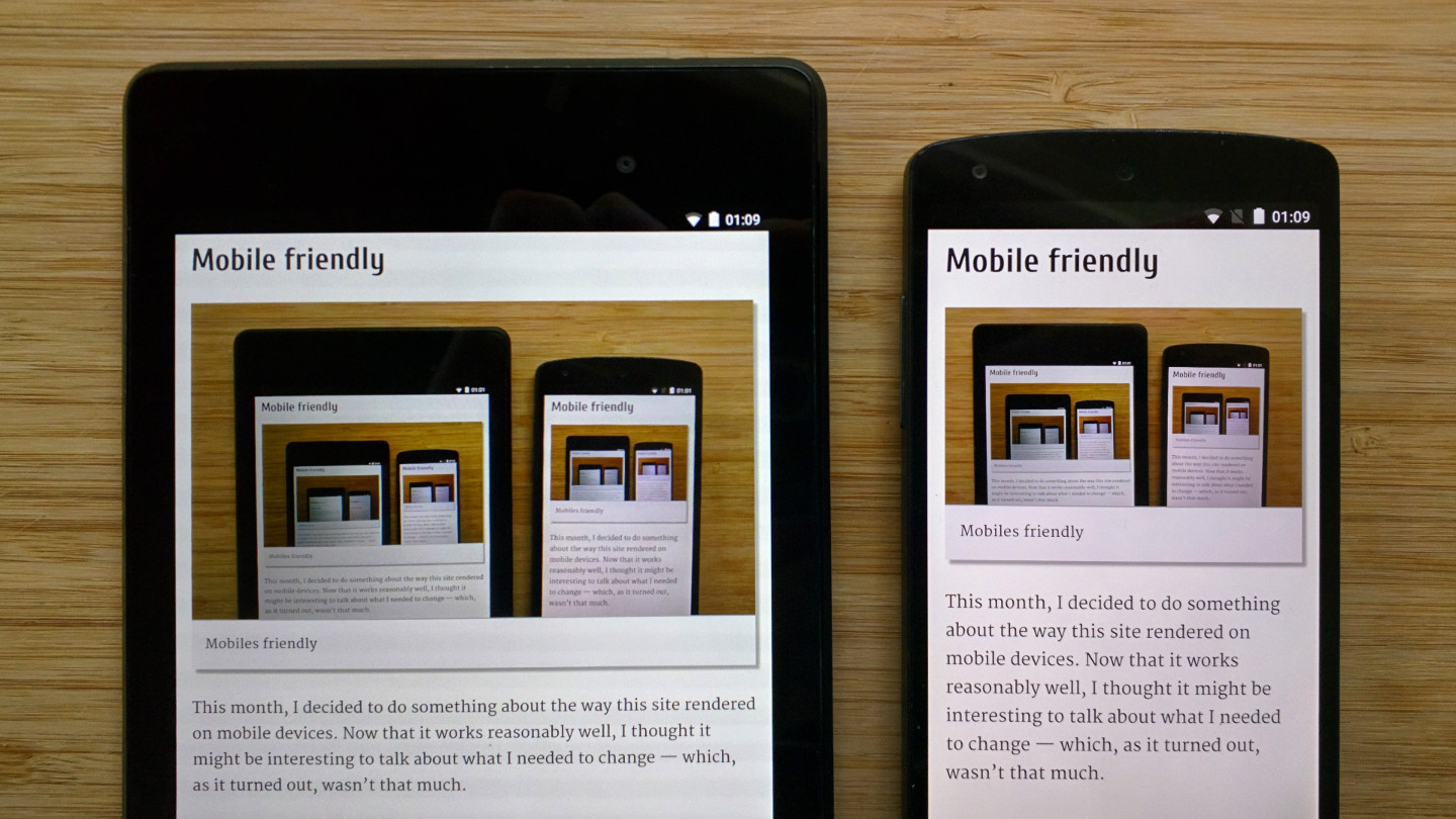
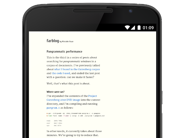
First off, here’s what things used to look like on a Nexus 6 (using my pangrammatic performance post as an example).
(Nexus frames from the Android device art generator, used under CC BY 2.5)
Double-tapping on a paragraph zooms to fit the text to the viewport, which produces something that’s fairly readable, but you can still scroll left and right into dead space.
As well as making it a pain to just scroll vertically, this also caused other problems, like the way that double-tapping on bulleted lists (which have indented left margins) would zoom the viewport such that it cropped the left edge of the main content area.
This is all pretty terrible, of course, and about par for the course for mobile browsers.
So what’s going on here? Well, for legacy reasons, mobile browsers typically default to rendering a faux-desktop view, first by setting the viewport so that it can contain content with a fixed “fallback” width (usually around 1000px), and then by fiddling with text sizes to make things more readable.
meta viewport to the rescue
This behaviour can be overridden fairly easily using the (de facto standard, but not particularly well defined) meta viewport construct. For example, this is what I needed to include to revert to a more sensible behaviour:
<meta name=viewport
    content="width=device-width, initial-scale=1">
The two clauses have separate and complementary effects:
width=device-widthsets the viewport width to the real screen width rather than the fallback width.initial-scale=1both sets an initial 1:1 zoom level, and also maintains that zoom level during device rotation (rather than maintaining the viewport width, as is apparently done by some devices). Importantly, the user isn’t restricted from zooming in further.
(This is all explained in rather more detail in the Google Developers document that I linked to above1.)
In practice, I’d recommend just taking the snippet above as a cargo-cultable incantation that switches off the weird faux-desktop rendering and fits the content to the screen.
So, after I’ve added the above, I’m done? Not quite.
overflow: visible
Our viewport still needs to be scrolled horizontally to reach some of the content, which is far from ideal, and we’ve no longer got any left-hand margin at all. All in all, it’s pretty hard to read our content even though it’s now zoomed in.
It’s probably worth taking a step back to look at the layout we’re using.
The overall page structure here is pretty trivial, roughly:
body {
  max-width: 600px;
  margin: 0 auto;
}
This centres the <body> in the viewport, allowing it to expand up to
600px wide.
We can fix the disappearing margins with body { padding: 0 1em; } (which
only has an effect if the body would otherwise be flush to the viewport
edges), and while we’re here, we might as well change that max-width:
600px to something based on ems (I went for max-width: 38em).
Most of the content of <body> is text in paragraphs; that’s fine. The two
immediate problems are code snippets (in <pre> blocks), and images.

Right away we can see a problem: the images have a declared width and
height, and aren’t going to adapt if the width of the <body> element
changes.
The code snippets have a related problem: <pre> text won’t reflow, and the
default CSS overflow behaviour allows block-level content to overflow its
content box, expanding the viewport’s canvas and reintroducing horizontal
scrolling2.
We can fix the code snippets fairly easily by enabling horizontal scrollbars for the snippets where needed:
pre {
  overflow: auto;
  overflow-y: hidden;
}
This uses overflow, a CSS 2.1 property, to ensure that content is clipped
to the content box, adding scrollbars if needed. It then uses overflow-y,
a CSS3 property, to remove any vertical scrollbars, leaving us with only
the horizontal scrollbars (or none). If the overflow-y property isn’t
supported (and in practice it is), the browser will still render something
reasonable.
Responsive images
That doesn’t help with the images, of course. The term you’ll want to search for is “responsive images”, but what we’re actually going to do is size the image so that it fits within the space available3.
One easy way to do this is to simply replace:
<img src="kittens" width="400" height="300">
with
<img src="myimage" style="width: 100%">
and, broadly speaking, that’s what I’m now doing4. Note that you
do need to drop the height property (and so might as well drop width
too), otherwise you’ll have an image with a variable width and fixed height
(which doesn’t work so well, as you might imagine).
There are some caveats with older versions of Internet Explorer (aren’t there always?) but in my case I’ve decided that I’m only interested in supporting IE9 and above5, so these don’t apply.
But wait a sec: we declared the image’s dimensions in the first place so that the browser could reserve space for the image, rather than reflowing the page as it downloaded them. Does this mean that we need to abandon that property?
Maybe. Somewhat surprisingly, there isn’t any way (yet6) to declare the aspect ratio (or, equivalently, original size) of an image while also allowing it to be resized to fit a container. However, all’s not lost: for common image aspect ratios, we can adopt a technique documented by Anders Andersen where we prevent reflow by pre-sizing a container to a given aspect ratio.
The tl;dr is that we use something like the following markup instead:
<div class="ratio-16-9">
  <img src="myimage" style="width: 100%">
</div>
We then pre-size the containing div using the CSS rule padding-bottom:
56.25% (9/16 = 0.5625; CSS percentages refer to the container’s width),
and position the image over the div using absolute positioning, taking
it out of the flow.
This works, but there are some caveats: it only works for images with common aspect ratios, of course (4:3 and 16:9 are pretty common, but existing images might have any aspect ratio), and, as written, it only works for images that are sized to 100% of the container’s width (though you could handle fixed smaller sizes as well, if desired).
In my case, I elected to make all images sized to 100% of the viewport width (which works well, mostly), and applied the reflow-avoidance workaround only to those images with 16:9 or 4:3 aspect ratios, leaving the others to size-on-demand.
I did notice some surprising rounding differences on Chrome that lead me to reduce that 56.25% of padding to 56.2% (which may truncate the image by a pixel or two; better than allowing the background to show through, though). I suspect this may be because Chrome allows HTML elements in general to have fractional CSS sizes, while it appears to restrict images to integral pixel sizes.
Just a quality of implementation issue
This gave me pretty good results, but I also took the opportunity to make a few other changes to make things work a little better:
- Where possible, I went back to the source images and replaced the version I had with a slightly larger (and more standard aspect-ratio’d) version. These (slightly) higher resolution images look a bit better on high-DPI screens (the Nexus 6 has a 2560×1440 screen, the same resolution as my 27″ Dell monitor, albeit at 493ppi rather than 109ppi; this is, quite frankly, completely ridiculous).
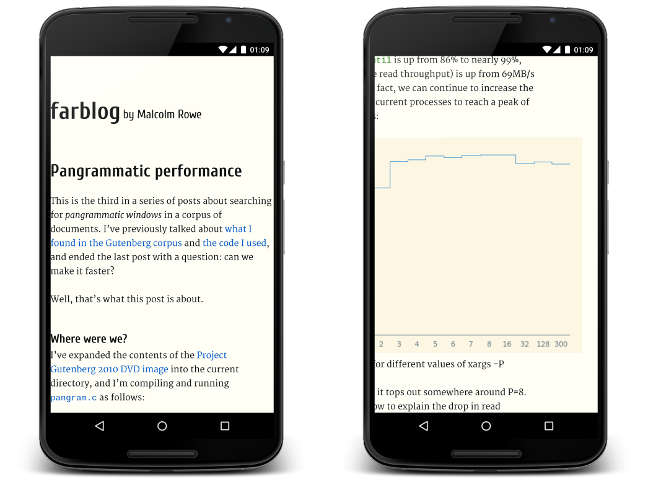
- I switched the gnuplot-produced PNG graphs to SVG images, which is something I probably should have done a long time ago. You can see an example in the pangrammatic performance post I mentioned above.
- In one case, I decided to try out multiple resolutions using the (not yet
supported by anything other than Chrome)
<img src="..." srcset="...">syntax. In this case, small-screen devices (e.g. iPhone 3G, if it supported the syntax) get a 320×182 image, desktop browsers get a 750×422 image, and hi-res devices like the Nexus 6 get a 1440×810 image). It’s not quite working completely right yet, but it looks promising. - I also simplified some of the more complicated markup I was using: I had
some instances of
<object>with an image content and fallback<table>content, which just about worked (and looked great in Lynx!), but which wasn’t easy to adjust to fit to the new approach. It doesn’t look like the new HTML5 image features (<img srcset>, and<picture>, which I’m not using) have any support for rendering arbitrary HTML in place of an image, which is a bit of a shame, but probably a reasonable trade-off. - Finally, I switched the AdSense ad slot at the bottom of the content to a ‘responsive’ ad unit, which will resize to fit the available space. On a phone, you can generally see it request a wider ad creative when you rotate the device, which is kinda cool. (It’s probably worth mentioning again that I receive no money at all from these ads; they’re only there because I’m currently working on the AdSense team.)
It’s worth noting that a lot of these changes also improved the site on desktop browsers. That’s not really surprising: “mobile-friendly” is more about adaptability than a particular class of device.
Resources
So there you have it: for a good mobile site, you may only have to a) add a
meta viewport tag, and b) size your content (particularly images) to adapt
to the changing viewport width.
Here are some resources (some of which I mentioned above) that I found useful:
- Configure the Viewport, a PageSpeed Insights article
describing what
meta viewportactually does. - Anders Andersen’s Responsive images – how to prevent reflow, about displaying responsive images with fixed aspect ratios.
- A List Apart’s Responsive Images in Practice, which covers some of the advanced techniques (that I’m not using) in more detail.
- The Responsive images community group demos
page, showing some examples of
<picture>and<img srcset>. - caniuse.com, for determining which browsers actually pay attention to some of this markup and CSS.
- BrowserStack’s cross-browser screenshotter, which allowed me to verify that I had, in fact, broken rendering on IE7, but nothing else (free usage is limited to a small number of uses, though).
- The Google Webmasters Tools Mobile-Friendly Test, which will highlight common problems that make sites mobile-unfriendly.
-
Somewhat surprisingly, this is the best reference I’ve found for what the
meta viewporttag actually does. ↩ -
In theory, the same problem can occur for other elements; for example, an unbreakable URL in running text can cause a
<p>element to overflow. In practice, though, that’s not something that I’ve found worth handling. ↩ -
There is more to responsive images than just resizing. For example, you can serve completely different images to different devices using media queries (so-called “art direction”). However, that’s way more complicated than what I needed. ↩
-
You can alternatively use
max-widthif you only want to shrink images wider than their container; I also wanted to enlarge the smaller ones. ↩ -
Why only IE9? It’s available on everything going back to Windows Vista, and it’s the first version to support SVG natively and a bunch of CSS properties that I’m using (::pseudo-elements, not(), box-shadow, to name a few). Windows XP users could well have trouble connecting to this server in the first place anyway, due to the SSL configuration I’m using, so requiring IE9/Vista doesn’t seem too unreasonable. ↩
-
From what I’m lead to believe, this is being actively worked on. ↩